Skills
Design leadership Interaction design
Background
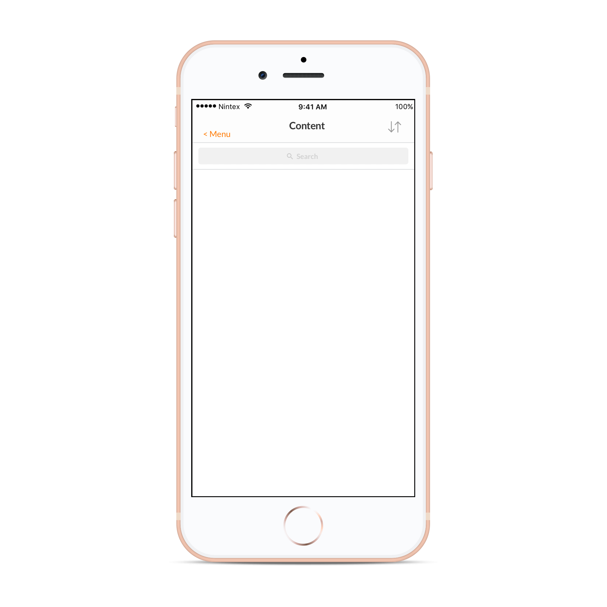
- Often in applications, especially mobile apps, users are shown empty screens — perhaps they have no tasks or they are only starting to use the app. User evaluation showed that users found these blank screens confusing and even thought the app was “broken”.
- These same applications often have settings sections that are created as an afterthought without much consideration for those who use it.
- I feel elements like this – such as error states, login areas – offer a good opportunity to improve the everyday user experience.
Challenge
- Empty interface: Needed to present information to the user on how the system worked, rather than showing an empty screen.
- Settings: Needed to bring this section into the same design language as the application whilst respecting platform conventions.
Actions
I created a series of empty states and errors to inform the user what was happening to the system. I tested these with users to see if they were understood.
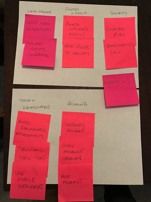
For the settings section rather than simply re-skinning the settings, I involved users to create a user centred hierarchy.
Results
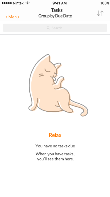
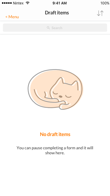
The “empty state” designs were very popular in community and user evaluation and turned empty screens into means of educating the user.
This design was used in the mobile app and the concept of empty states used in all other products.
An early design used cats to charm and relax the user.
The cat motif was greatly loved in user testing — people named the cat “Nelix — the inline feline” but sadly the concept was not green-lit.
The finished design for setting was used in iOS/Android and even Windows Mobile. All design respected Material design / iOS HIG guidelines.


This settings area tested well with people being able to find settings easier than previous (1st click analysis).